
September 22 Dan Zen Expo Exhibit
 Logos
Logos
Dedicated to Frank Melendez for his Touchy logo love!
The Logo Exhibit presents the history of the many site and app logos presented in reverse chronological order although we start with a comparison of the Dan Zen totem signature logos.
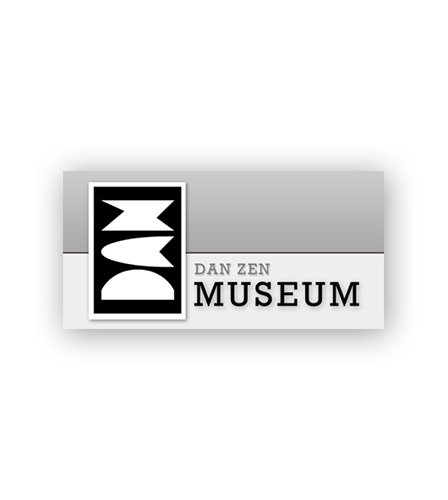
 Dan Zen Museum Signature (2014) ▲ The signature spells DAN going up and ZEN going down. The Museum logo was created in a font made by Dan Zen and it has a very art deco look that Zen found captured the feel of a museum. The logo was used as tickets for the museum. The same font would later be used for the Dan Zen Expo. VISIT MUSEUM
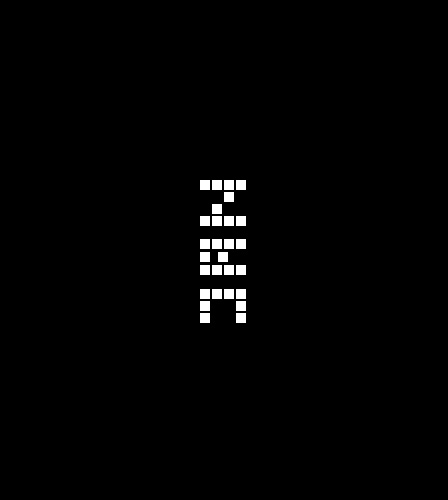
 Dan Zen Dark Signature (2012) ▲ The Dark signature was fun as it was made with big pixels to take us back to the early digital age. The signature also changed colors when pressed. The straight stick of the D was removed making the ZEN more readable. VISIT DARK
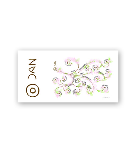
 Dan Zen Tree Signature (2010) ▲ The tree logo has a more organic look and sits above Node Zero with the menu branching out to the right. This was the first logo with the straight stick of the D removed from the DAN going up to make the ZEN going down more clear. VISIT TREE
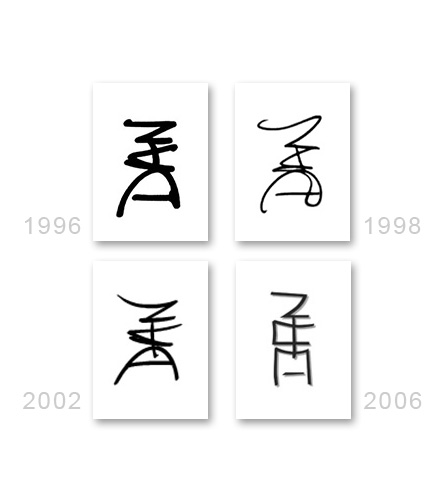
 Dan Zen Totem Signature Logos ▲ The Signature Menu in 1996 was based on a coincidence where a simple psychology-type test yielded the same pattern as Zen's signature. The signature is 16 color grayscale and a little thick for current tastes. The Board Menu in 1998 looked like a board game with the signature in the middle - a touch looser but not as expressive and the Pagoda Menu of 2002. Zen further moved towards an Asian look with the Deck Menu in 2006.
 Agency Zen (2001) ▲ This logo, related to the totem signatures, spells ZEN going up and ZEN going down. This was to be used to sell branded versions of various Dan Zen features but Zen went into teaching instead. Zen still uses Agency Zen for any money transactions. AGENCY ZEN
 Dan Zen Expo ▲ The EXPO logo is made from the same font as was created for the Dan Zen Museum. The word is presented in two rows and columns making it ideal for icons and of size and shape to sit nicely above the Dan Zen totem signature. The first version of the Expo was various shades of green but Zen reverted to his usual grayscale interface. A couple of effects in Photoshop have been used including two-toning and a light stroke with a drop shadow. This gives the logo a cut out feel which is slightly old fashioned and posterish - ideal for a Museum Expo! VISIT EXPO
 Droner (2014) ▲ The mobile game where you control your friends! A neat thing about this logo is that it was placed in the middle of the app and as you chose to be either a drone or a droner the page would slide up or down. If it slid up, the logo was at the top and if it slid down, the logo was at the bottom. The Droner logo itself features a slightly bigger second Droner word that represents a pulsing droning sound. VISIT DRONER
 Trippy (2013) ▲ The Trippy logo is just a little wonky looking with multiple renditions of the word overlapped in a loose groovy font. VISIT TRIPPY
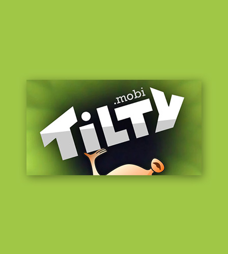
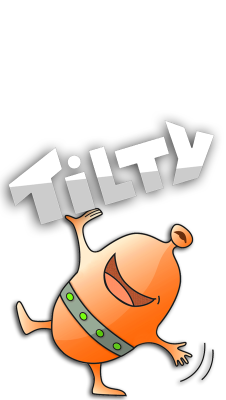
 Tilty (2013) ▲ Following in a similar style to the earlier game, Touchy, the Tilty logo is glossed. The logo is tilted to match the name of the game and is being held by the Tilty bean initially sketched by Zen's wife, RoseAnne. The font was made by Dan Zen using the pen tool in Flash. VISIT TILTY
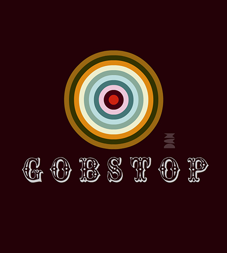
 Gobstop (2013) ▲ The Gobstop logo uses a circus-like turn of the century font to get across an old fashioned arcade type feel for this super fun addictive game to keep gobstops on the screen while licking them to get points. The logo sits beneath a randomly generated gobstop for extra color! PLAY GOBSTOP
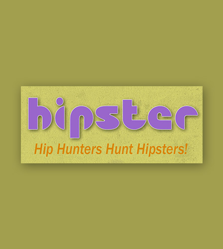
 Hipster (2012) ▲ The Hipster logo, in delicate purple, is set off with a light stroke and dark drop shadow. The simple curvaceous font is slightly reminiscent of body parts. It is not overtly groovy but certainly getting there in a unique way. Sort of like the Hipster app itself where you take pictures of Hipsters, post them and tag them with mundane categories. VISIT HIPSTER
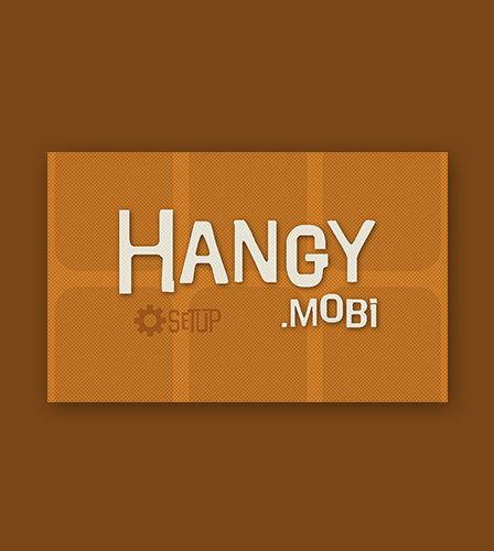
 Hangy (2012) ▲ A very dangly font was used for Hangy - the mobile app that allows you to express yourself from your device hanging around your neck as a mobidallion. VISIT HANGY
 Altura (2011) ▲ A mobile ready Web app to make pseudo interactive stories. An art deco look harkening back to the serial adventure VISIT ALTURA
 Swoodle (2011) ▲ Swoop around to doodle a Swoodle! A simple, elegant logo with a dash of color - perhaps a too recognizable font - but it has a touch of pizzazz as does the app. VISIT SWOODLE
 Wavy (2011) ▲ A sound toy where you wave your device around to make the pitch of a tone go up and down. The logo features a wave - how creative ;-) VISIT WAVY
 Touchy (2010) ▲ The initial logo was made by Frank Melendez:
Zen made some minor simplifications and grayscaled the logo into its final form. Many thanks to Frank for a wonderful direction with fingers touching! VISIT TOUCHY
 Kitty Tartan (2012) ▲ Drop a picture of your cat on Kitty Tartan and it makes a tartan (plaid) using the colors of the cat. The logo features a sewn looking font on plaid. VISIT KITTY TARTAN
 Opartica Tunnel (2010) ▲ The second version of Opartica features an op art pattern created with Opartica in behind the logo. Zen found it hard to leave the first logo as it was on posters that had fond memories - see Opartica below. VISIT OPARTICA
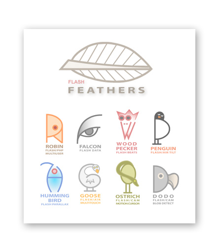
 Flash Feathers (2009) ▲ A set of fun logos where the birds were created from the first letter of the apps. Which ones is your favourite? VISIT FLASH FEATHERS
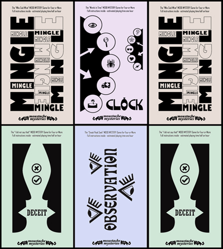
 Mood Mystery (2008) ▲ at your next party, try a mystery game with no plot - only theme and mysterious communications. equivalent Zen worked the logos into the promotional material. VISIT MOOD MYSTERY
 Zen Mix (2006) ▲ Zen Mix was one of the last in a series of "Zen" tools - most of which had little logo icons. Zen Mix allows you to put any Web picture onto a Web video and apply blend modes. The logo uses the Z to get across the idea of mixing.VISIT ZEN MIX
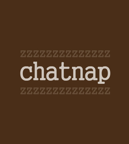
 ChatNap (2006) ▲ The logo is bordered by ZZZ representing snoring as you have fallen asleep chatting. If you receive a message saying click to chatnap and do not do so in five minutes then you lose points - if you do click, you gain points. VISIT CHATNAP
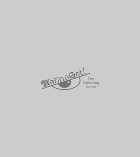
 WannaGet (2005) ▲ The logo makes eyelashes across an eye that is eying what it wants to get in this fun collecting game that was made for blog sites. VISIT WANNAGET
 Tapoll (2005) ▲ Web 2.0 - remember that? Everyone was making bubbly colorful logos at the rebirth of the Web after the dot com crash in the early 2000s. Tapoll is a contraction of Predict-a-poll the first name for the voting app where you predict poll results at the same time as you vote on them VISIT TAPOLL
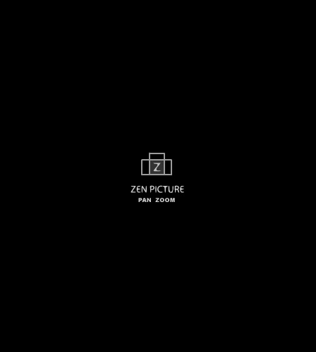
 Zen Picture (2005) ▲ Another of the "Zen" tools with a little icon logo. The app animates horizontal pictures horizontally and vertical pictures vertically thus the two overlapping rectangles. It also makes an image of a camera. VISIT ZEN PICTURE
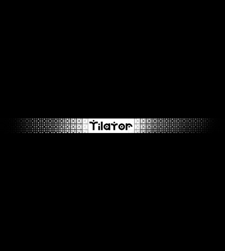
 Tilator (2004) ▲ Offset with a circular tiling the logo features a pretty dotty font! VISIT TILATOR
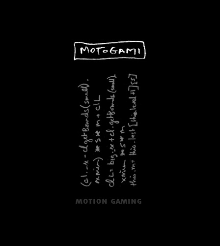
 MotoGami (2004) ▲ Short for Motion Gaming, the title has a somewhat Asian sound so it was coupled with computer code presented in a scroll-like manner. VISIT MOTOGAMI
 Zen Pass (2004) ▲ Another of the "Zen" tools with arrows indicating the passing flow. Zen Pass is a system that lets content creators sell cards to promote their online wares. Many of these logos used a simple font that had its corners rounded to create a more organic look. VISIT ZEN PASS
 Zen Motto (2003) ▲ Obviously, with Zen in the title, features took on an Asian aura - Zen Motto certainly emphasized this and the content created by Zen Motto was very Koan-like. VISIT ZEN MOTTO
 Zen Play (2003) ▲ An early "Zen" tool using the play button triangle to offset a Z. The domain ZenPlay.com was sold to another company as the tool was primarily an internal tool used to present Web pages as a slide show. We still have not seen anything else like this and it was very useful for open houses, etc. VISIT ZEN PLAY
 Opartica (2001) ▲ The original Opartica logo is very striking against the three op art shapes. A subtle Russian font harkens to futurism at the turn of the century although, Op Art was coined in 1964 when Zen was born. Opartica has gone on to be one of the foremost online op art tools.VISIT OPARTICA
 Spy-Mail (2001) ▲ An early messaging service where the messages self destructed ten minutes after reading. If you did not make the messages private, other people could spy on them. The logo was presented as if looking through a spy glass. VISIT SPY-MAIL
 Save Earth (2000) ▲ the late nineties was a time where zen made sites in a beveled brush steel look. Save Earth featured a remote control to control drones to map patterns around the earth. The patterns were taken from an amazing wallpaper that looked silver even when scanned into the computer. VISIT SAVE EARTH
 Garden (2000) ▲ Zen uses Zen garden stones as a backdrop for letters of the logo in what is the equivalent of a guest book. VISIT GARDEN
 Grim Reaper's Age Guesser (1997) ▲ the logo on the scythe of the Grim Reaper - how spooky - note the ripple effect on the font. VISIT GRIM REAPER
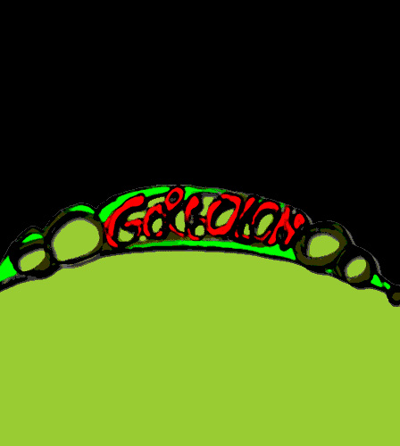
 Gorgolon (1996) ▲ We are moving into early times with sixteen colors, etc. Here is the Gorgolon logo looking very hand drawn and organic. Gorgolon is an underwater civilization and the game is to spot the artificial intelligence. VISIT GORGOLON
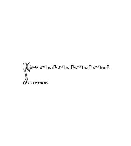
 Teleporters (1996) ▲ Teleporters featured the height of interactivity - the roll over! To take you to a site when you roll over them. The logo was an animated gif and the rays moved back and forth to represent teleportation! VISIT TELEPORTERS
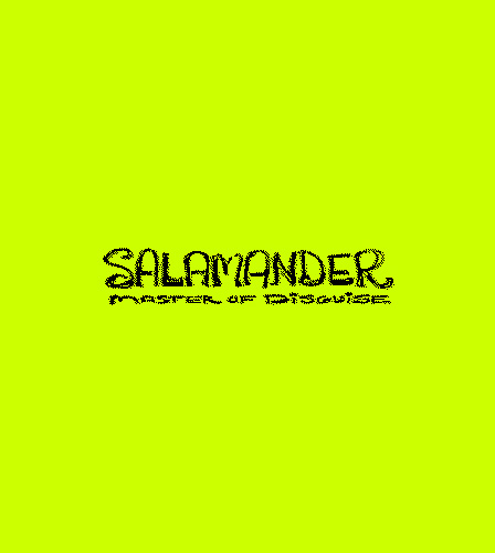
 Salamander (1996) ▲ Hand drawn by Zen and dithered to create a spotty effect - the Salamander logo takes on an art nouveau feel. VISIT SALAMADER
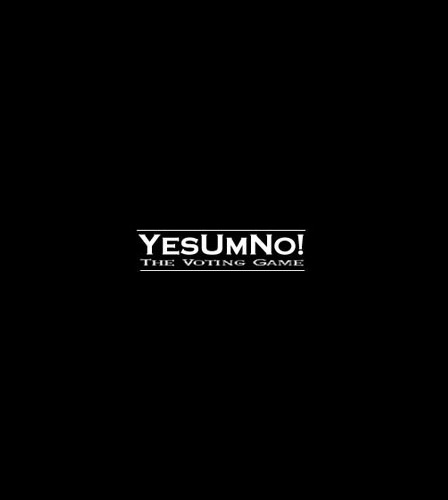
 YesUmNo (1996) ▲ The logo provides the interface for this communal voting game. Friends sit around the same computer and take turns pressing the logo to enter their vote. Yes, Um (I don't know or care) and No... YesUmNo. VISIT YESUMNO
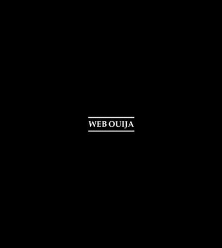
 Web Ouija (1996) ▲ Slightly mystical - in the spirit of the Ouija board font but perhaps a little more modern. The Web Ouija is like a magic eight ball - it tells you things as you roll over different parts of the screen. VISIT WEB OUIJA
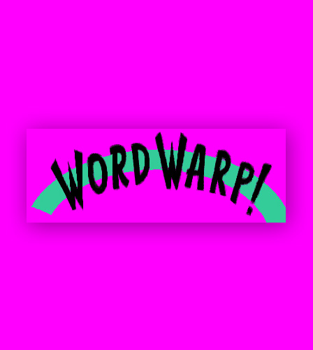
 Word Warp (1995) ▲ One of the first Dan Zen features - features a rather garish logo and coloring - WORD WARP! It was overlayed on a spiral that indicated the rules of the game as you spiraled toward the center finally presenting the current topic to anagram! VISIT WORD WARP
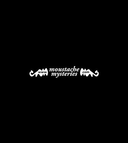
 Moustache Mysteries (1995) ▲ The logo makes up a moustache with the www and com set in the curly ends. Quite a compact, elegant logo even by today's standards and certainly has lasted many years as the main location for Dan Zen interactive mysteries. VISIT MOUSTACHE MYSTERIES
So, that concludes the Logo Exhibit. One certainly sees the changes through the ages. There were times when time was tight and not too much time was spent on the logo. In many cases, though, quite a bit of thought and ingenuity was applied.


|
 Logos
Logos


 Logos
Logos