
February 2 Dan Zen Expo Exhibit
 Interfaces
Dedicated to Wayne McPhail
The Dan Zen site is filled with experimental interfaces. Zen graduated from Engineering specializing in ergonomics and interface. He teaches Interactive Coding and Interface Design at Sheridan College in Canada. This exhibit focuses on how people use the Dan Zen applications to create, communicate and play.
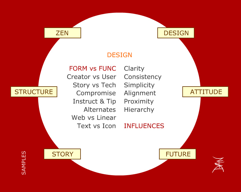
 Interface ▲ An interface is the part of a system through which the user interacts. Inter meaning between and act as in do. Generally, this relates to the senses. There is input and output. There are physical interfaces such as knobs, handles and buttons for input or screens, bells, and beeps for outputs. Then there are digital interfaces, many of which match a physical counterpart - for instance, a slider. Common Web interfaces are buttons, checkboxes, menus, text boxes, etc.
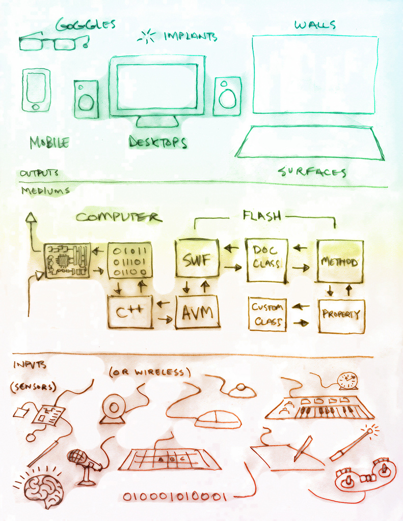
 Computer Input and Output (2008) ▲ Here we see various physical computer interfaces sending their signals to be captured by the computer where the signal gets sent through hardware and software and arrives at custom code. This is the code that Dan Zen writes. Zen then decides on what to output and the signal is sent back out through the software and hardware to various outputs. The computer acts as a medium as in it sits between.
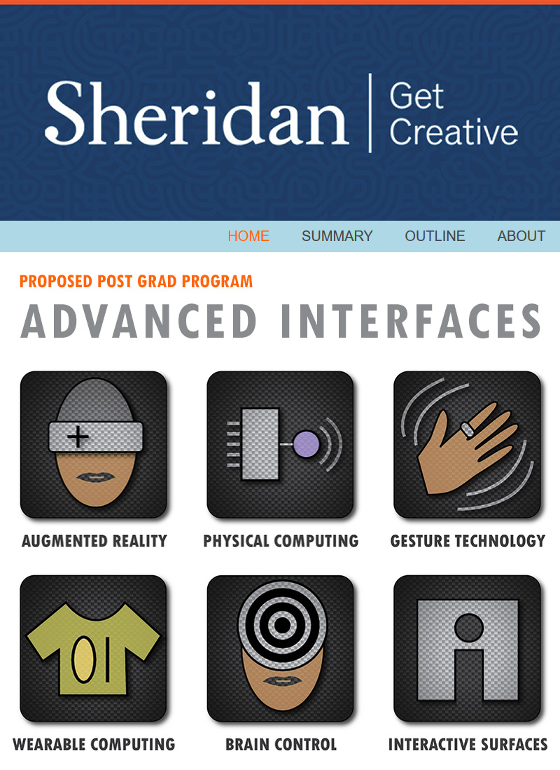
 Advanced Interfaces (2013) ▲ Advanced Interfaces was a proposed post grad program where students make projects in areas such as augmented reality, physical and wearable computing, gesture and brain technologies, etc. The Interactive Media program where Zen teaches was given more time to include these topics so a new program at this time is not needed. ADVANCED INTERFACES

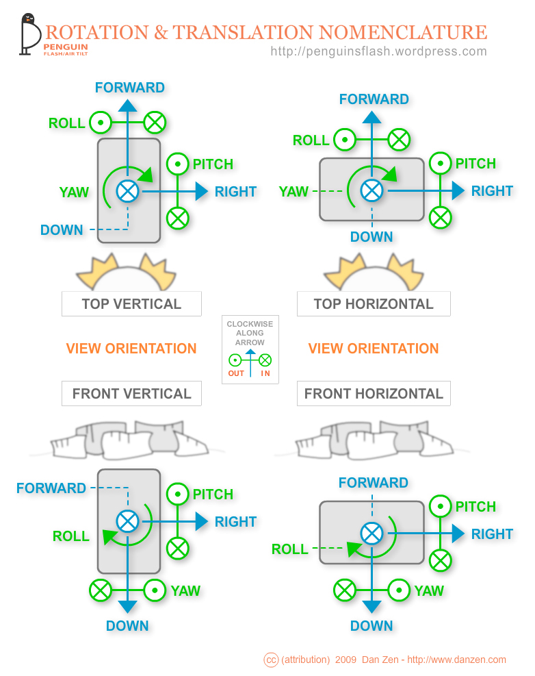
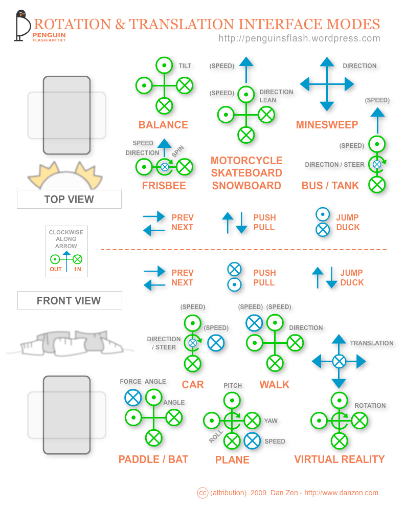
 Tilt (2009) ▲ Nomenclature and Example diagrams for tilt and translation interfaces. Here we were at the dawn of tilt interfaces on mobile smart phones. Translation is still to come. These diagrams were for a set of advanced interface classes called Flash Feathers - see below. WATCH VIDEO
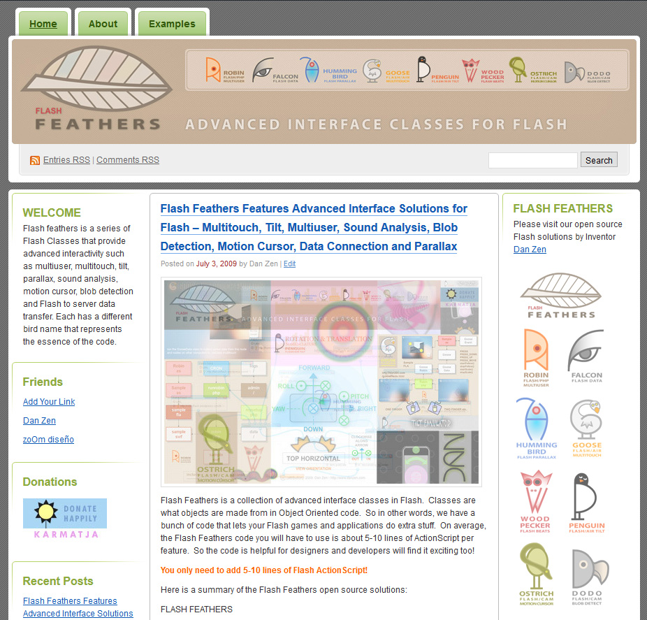
 Flash Feathers (2009) ▲ A series of advanced interface solutions for Flash including multitouch, tilt, multiuser, sound animation, blob detection and gesture motion cursors. You can read more about this in the Code 2 Exhibit FLASH FEATHERS
 Dan Zen Usability (2006) ▲ A presentation site made for a University of Toronto guest lecture on usability. The examples section has a set of summaries of unique interface experiments for a couple dozen Dan Zen features. VISIT USABILITY
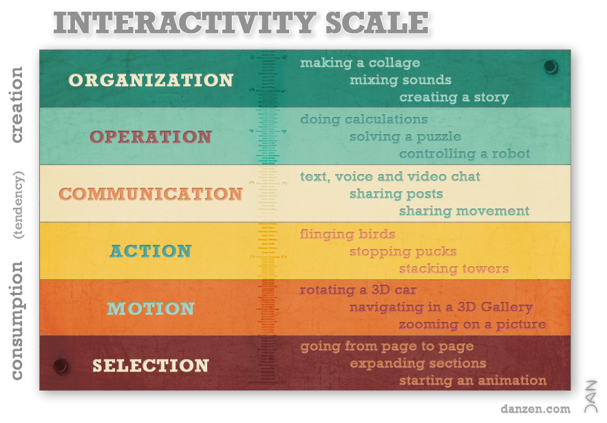
 Interactivity Scale (2011) ▲ Much of the interface and usability literature is about navigation for consumption. Dan Zen tends to build features where people get to create. The Interactivity Scale is an attempt to match types of actions to a consumption and creation scale. This way, Zen reminds us that there is more to interactivity than just selection for consumption. INTERACTIVITY SCALE
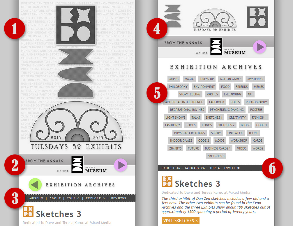
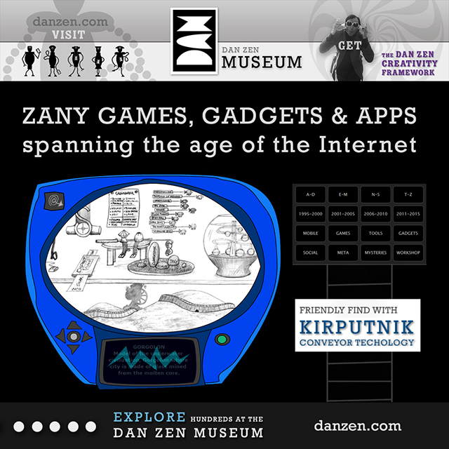
 Dan Zen Expo (2015) ▲ The Expo is the current Dan Zen front page. In 2014, Dan Zen turned half a century old and created the Dan Zen Museum. The museum had a set of stairs and tour and explore sections. Even though the steps were somewhat dynamic, and the content in the explore section was being added to, the museum felt too static. Zen asked himself, what would a museum do? The answer, is they would host exhibits. So, the Expo with its weekly exhibits for 52 weeks until Zen turns 52 was created. Below we describe the interface elements numbered in the diagram above. VISIT EXPO
- A risky interface move to use such a big header graphic. Normally you would want more content above the scroll. Zen knew the exhibits would have long scrolls so in the scheme of things, a larger header helps the balance. The picture is intended to be like a poster - a very memorable part of world expos. Note the efficiency and balance of the design - of course well suited to portrait mode on mobile. The layered background gives extra information to explore if desired.
- Arrow bars off to the Museum and the Archives. These arrows are quite enticing and it is possible that as the visitor scrolls, they might immediately press the museum arrow and completely miss the exhibit below. Well, if this happens, they are on there way to over 100,000 pages of content so bon voyage!
- Zen added this link bar partway through the exhibit to help people find more about the Expo and Dan Zen in a traditional way. There are also direct links into the Tour and Explore sections of the museum (note, these pop up new tabs so get an up arrow treatment) and a reviews section.
- The Archive page gets a smaller header which also clicks back to the main Expo page.
- The topic link cloud was added partway through the exhibit as the scroll of exhibits became longer and longer. The order is the exhibit order but it is possible that an alphabetical order might be more helpful.
- A listing of exhibits along with dedications and summaries. Top and invite links are available all the way down. The listing might benefit from a picture for each. The plan is to replace the front Expo page with an animated graphical menu into the archives once the exhibits are complete.

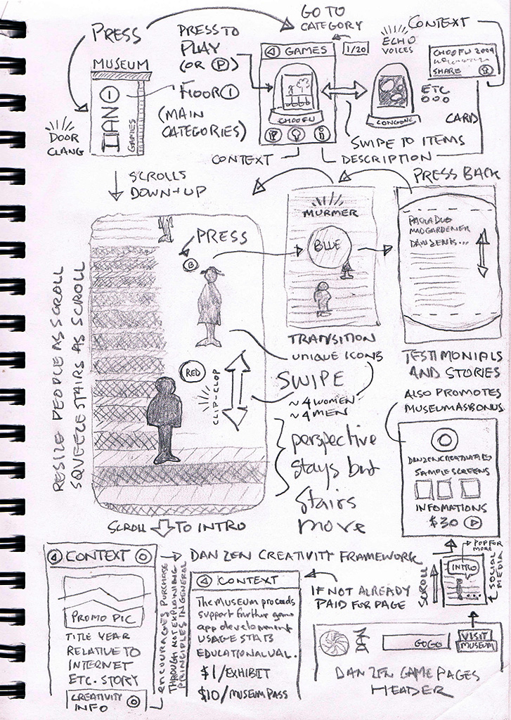
 Dan Zen Museum (2014) ▲ The Museum uses a swipe interface which is prevalent on mobile but almost unheard of on desktop. There are no scroll bars - the whole page is a scroll bar. Page up and down and mouse wheel also move the visitor up and down the stairs. The site features fade transitions, screen-shot icons, action-scroll pages and an overall museum metaphor. Here are some of the specifics:
- The loading screen displays progress with dots that move from the bottom to the top of the page. These clearly represent loading but use the light metaphor of travel steps - like dots on a map indicating that we are moving to the museum.
- We arrive at steps. These the visitor can swipe to move up and down and greet the various drones that are on the steps all carrying Museum tickets reinforcing the Dan Zen logo.
- If the visitor does not know how to navigate, they might press on the main drone with the Dan Zen name at the bottom. A speech bubble appears that gives immediate navigational instructions followed by an overview of content. There are links under the scroll to the main museum sections but it is preferred they enter through a ticket.
- On scrolling a ticket will appear and indeed there a number of tickets as the list of drones to scroll by is in the hundreds.
- Entering through a ticket fades you out and in to the Tour or Explore page. Note the way back to the stairs is a screen capture of the stairs.
- Choosing the Tour takes you to a page with reinforces the dot motif for walking through the museum. And the way back to the Tour or Explore page is a screenshot of that page.
- Taking a tour leads to a simple page with all sorts of text and pictures in a long scroll. These are divided into rooms by neat little walls and again the dotted lines for walking. All the links are prominently displayed as pink buttons.
- You can open up the rooms guide near any room to jump to specific rooms.
- The Explore section has a menu for alphabetical, chronological and topic based filters. The metaphor is the Kirputnik Conveyor bringing back the Dan Zen robot Webmaster featured in the 2002 Kirputnik Cam. The conveyor animates the features as does swiping on mobile. Promos and up buttons are placed on the track between the cards.
- The feature cards show a picture (the same pictures from the 2006 Deck of Creations interface). Icons set off the title, date and short description and dedication. A message as to whether the feature is mobile ready or desktop optimized is displayed. More information expands open a longer description. The information icon flips to show you can collapse it. And a big launch button entices the visitor to try out the app.
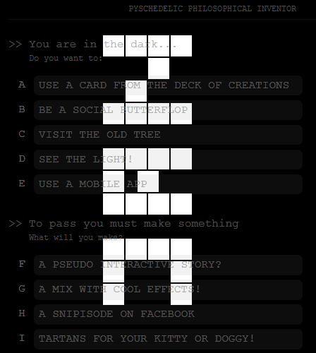
 Dan Zen - Dark (2012) ▲ The main Dan Zen interface before the Museum. This site was mobile ready and used the metaphor of early Internet text based games where you choose what to do. Some options opened up more options and they were denoted with >>. Icons lined the side if there was enough room otherwise adaptive design techniques hid them. As the metaphor was potentially tricky, a yellow text topic was provided to help add clarity. The subsections after the main guidance section appeared in random order each load to give all topics a chance to be seen. YoYo was used to show feature YouTube videos inside of a traditional ad banner. This added a touch of color and movement to the site.VISIT DARK
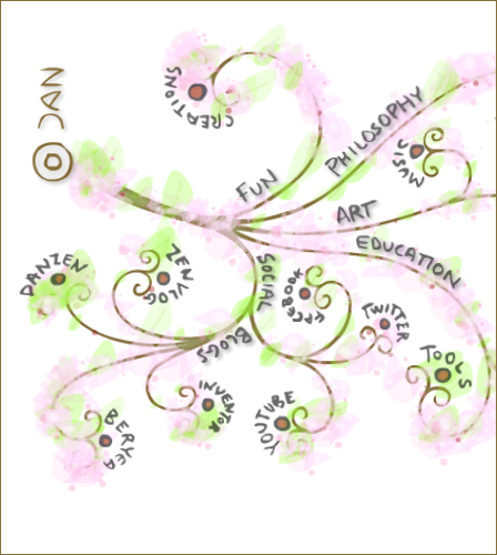
 Dan Zen - Tree (2010) ▲ Tree is a Flash based light parallax interface which acted as an umbrella site menu to Dan Zen. The main Dan Zen site remained the Deck of Creations and this was located under the Creations link in the FUN branch. Other main branches were PHILOSOPHY, ART, EDUCATION, and SOCIAL. These curled nicely into various other branches as a tree is a hierarchy. Zen was working a lot during this time on hierarchy in his philosophy of Nodism. And indeed, his signature for this metaphor sits above Node 0. VISIT TREE
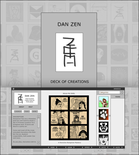
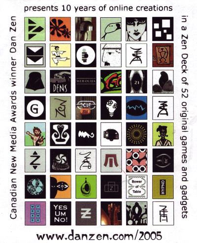
 Dan Zen - Deck (2006) ▲ The Deck of Creations started with a simple intro page to help search engines reference the site. The main deck is a Flash app based on Zen Deck technology created for the Rich Deck collecting game. The light metaphor is card collecting games. Information could be seen for each card such as image, title, icon, short and long descriptions and categories. This was stored in XML and dynamically loaded so the Deck was very easy to maintain. Too easy... which allowed the deck to live longer than any other Dan Zen interface and perhaps overstay its welcome. The Deck also introduced the iconomizer which showed icons as a scroll bar - you scrolled the whole thing or grabbed the bar behind to scroll quickly. There was zoom, pan, slideshow built in as well as expanding text areas. These functionalities were well ahead of any HTML based apps of the time. VISIT DECK
 Dan Zen - Pagoda (2002) ▲ The Pagoda of Games was a Flash motion graphics menu using a game arcade as a light metaphor. People would enter through the Dan Zen signature pagoda door. An original sign up / sneak in entrance increased the registration for Dan Zen. The registration featured vertical fields in the Asian orientation. Once inside, pages of games and apps would animate out at the visitor allowing them to pick from the menu. The last page had an option to turn off the animation for quicker access. All secondary pages of each version of Dan Zen were designed to match the main interface but they have been adjusted to match the current interface. The secondary pages during this time showed how many people were in line to get into Dan Zen and if you donated, it would let them all enter. This extra incentive increased sales 1000%. VISIT PAGODA
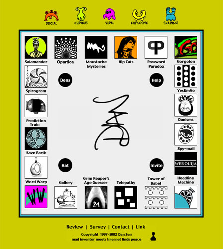
 Dan Zen - Board (1998) ▲ The Board interface obviously is a metaphor for board games and used the height of HTML technology at the time - JavaScript rollovers. Instead of changing the item that was rolled over, an promotional blurb would appear next to the logo icon that would describe the feature. This structure was a little difficult to update, but was able to grow in pairs. It had planned obsolescence in that Zen knew it would fill up in a few years. VISIT BOARD
 Dan Zen - Signature (1996) ▲ The first Dan Zen interface used a paper based game as its entrance. Based on the shapes chosen, a totem was created and the Zen totem happened to match his signature. You can try it out to see what we mean. Zen used the shapes as icons for the sections. VISIT SIGNATURE

 Dan Zen Features (1996-2016) ▲ Each of the 100 Dan Zen features has unique interface aspects. These have all been discussed in several sets of summaries - indeed, each of the main Dan Zen sites provides a description area highlighting special techniques. There are also three in depth articles on inventing for interactive media. These put the creations in context of the times:


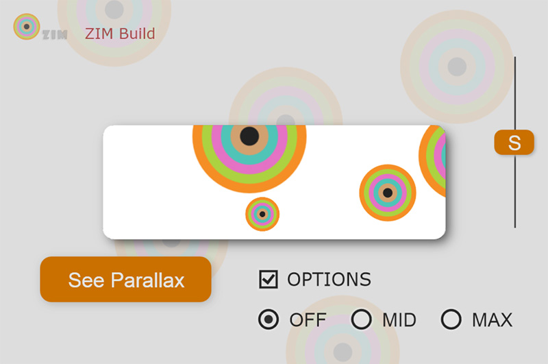
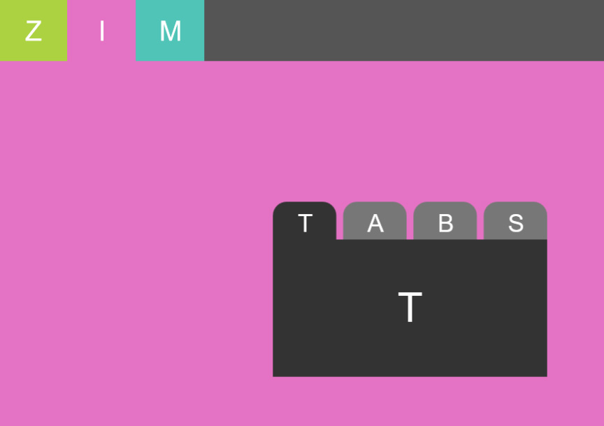
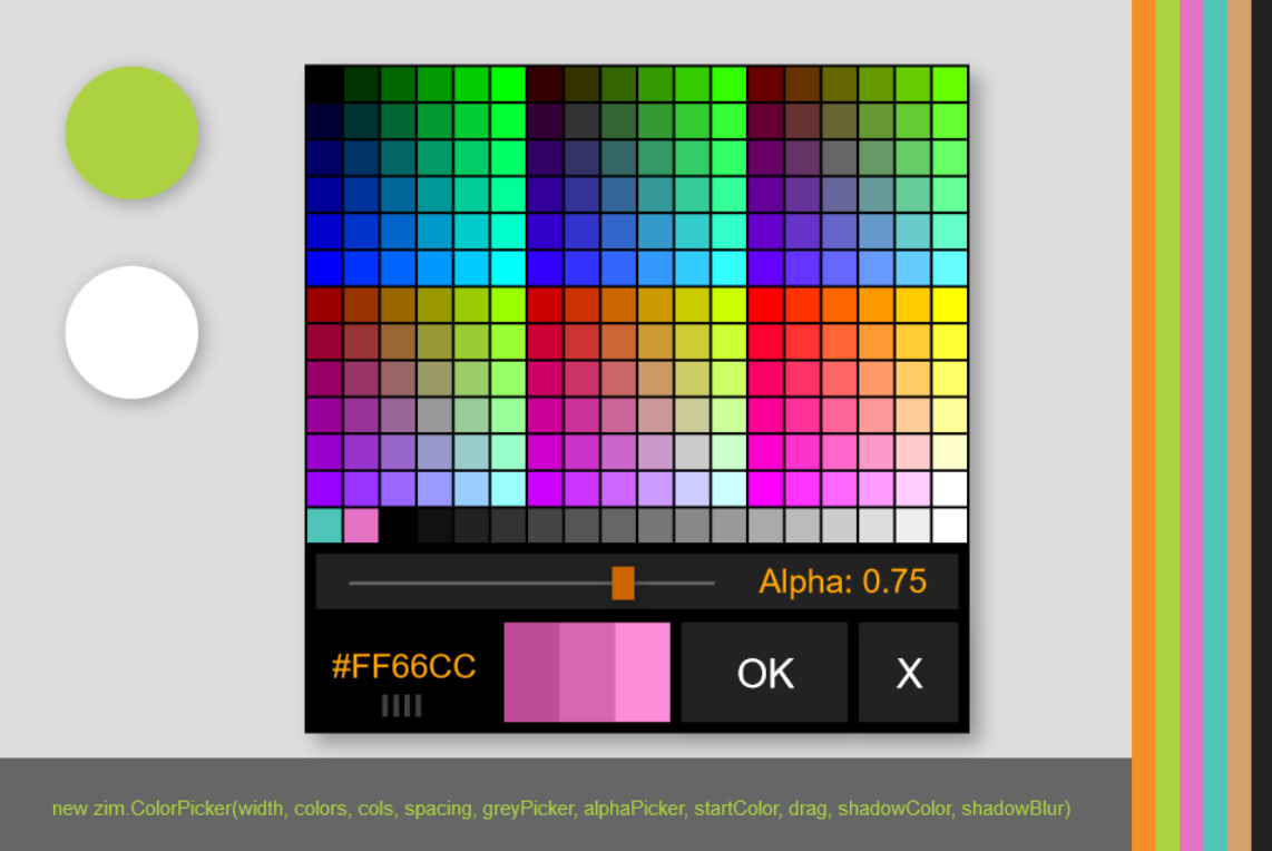
ZIM Interfaces (2014-2016) ▲ ZIM is a library of code that helps people make interactive media on the HTML Canvas with JavaScript. press the pictures above for working examples. ZIM features components for interfaces like buttons, panes, sliders, pickers, etc. as well as interface features such as swiping and responsive page layout. In doing so, Zen is one of the first people to bring components to the HTML Canvas. VISIT ZIM
This concludes the Dan Zen Interface Exhibit. There are more related notes in the Dan Zen Museum Creativity Tour where a breakdown of how Zen creates apps is provided in the Project Creation room. Also the Code 1 Tour and Code 2 Tour show the code in behind the interfaces.

 Interfaces


 Interfaces
